
Project Goal
To research current industry trends and establish best practices for designing marketing visuals for App Store and Play Store listings, with the aim of clearly communicating the value of TD Bank apps, improving visibility in app stores, and driving higher conversion rates (installs).
Approach
Research
Conduct industry and platform best practices research for app store visuals
User Survey
Gather user insights through surveys to understand preferences and decision drivers
Define
Define clear design principles and prioritize key messaging themes
Explorarion
Explore multiple design and content directions aligned with user needs and goals.
Visual Design
Create and refine final visual desings optimized for App Store and Play Store conversions
Best Practices Research
We studied and analyzed more than 40 app listings across a range of industries, including financial institutions, banking, insurance, health and fitness, food, clothing, and more.
The main target audience for the TD Bank US app consists of late adopters. Through this market study, we identified best practices, common patterns, and key insights to help reduce barriers and encourage customers to download and use the app.

User Survey
We conducted a 14-question survey and received 364 responses from users across various teams at the bank to understand how they view and interact with app listings.

Previous app listing- Key Issues
-
Visual layout is monotonous, with similar image structure (title + mobile screen), making it uninteresting to browse
-
Lacks clear visual hierarchy; important features are not effectively highlighted
-
Content lacks cohesive storytelling, reducing engagement
-
Screen sequence feels unstructured and not thoughtfully organized
-
Heavy use of dark green is overwhelming and limits visual variety
-
Overall design feels generic and outdated, lacking modern appeal

Design and Content Exploration
-
Visual layout is monotonous, with similar image structure (title + mobile screen), making it uninteresting to browse
-
Lacks clear visual hierarchy; important features are not effectively highlighted
-
Content lacks cohesive storytelling, reducing engagement
-
Screen sequence feels unstructured and not thoughtfully organized
-
Heavy use of dark green is overwhelming and limits visual variety
-
Overall design feels generic and outdated, lacking modern appeal

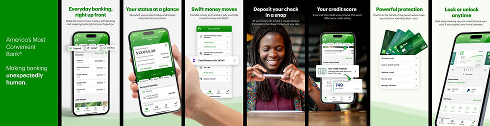
App Store Listing Modernisation

Great apps take months or years to build, but success also depends on how they’re presented on the App Store and Google Play Store. In a crowded market, strong positioning is key to driving downloads.
Mobile View
Tablet View


The Project Team
We led an app listing modernization initiative to improve visibility and conversion. By refining messaging, visuals, and overall presentation, we created a more engaging and informative store presence, helping users quickly understand the app’s value and make confident download decisions.

More Projects

Research · Interaction Design · Design System · UX & UI Design · Client Work
